When it comes to iconic logos, few can rival the instantly recognizable symbol of an apple with a bite taken out of it. The Apple logo has become synonymous with innovation, design, and cutting-edge technology. But have you ever wondered about the history behind this simple yet powerful logo? Join us as we take a journey through time and explore the fascinating evolution of the Apple logo.
The Birth of the Apple Logo

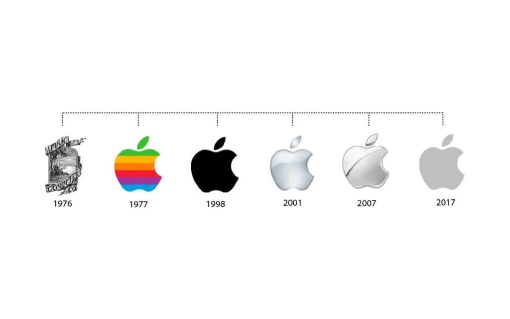
In 1976, Steve Jobs and Steve Wozniak co-founded Apple Computer Inc. and set out to create a logo that would represent their brand. The first Apple logo, designed by Ronald Wayne, featured a detailed illustration of Sir Isaac Newton sitting under an apple tree. While this logo was conceptually strong, it proved too intricate and complex for practical use.
The Rainbow Apple

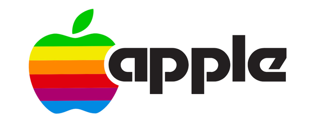
In 1977, Rob Janoff, an employee at the advertising agency Regis McKenna, was tasked with redesigning the Apple logo. The result was the iconic rainbow-colored Apple logo, featuring a bitten apple with six multi-colored stripes. The rainbow symbolized the Apple II’s ability to display color graphics, and it quickly became synonymous with the brand’s identity during the 1980s and early 1990s.
Simplifying the Logo
As Apple’s product line expanded and the company evolved, the need for a simpler, more streamlined logo became evident. In 1998, Apple introduced the monochromatic logo we know today— a sleek, silver apple with a bite taken out of it. This minimalist design reflected Apple’s commitment to simplicity and elegance in both hardware and software design.
The Glass Apple
In 2001, Apple introduced a new logo as part of its “Think Different” campaign. This logo featured a glossy, 3D glass apple with a metallic stem. It aimed to convey a sense of modernity and sophistication, aligning with the company’s innovative products and design philosophy at the time. However, this logo was short-lived and was replaced by the classic silver logo in 2003.
The Apple Logo Today
Since 2003, the Apple logo has remained relatively unchanged. It has become an instantly recognizable symbol worldwide, synonymous with Apple’s commitment to innovation, user-friendly design, and cutting-edge technology. The logo appears on all Apple products, packaging, and marketing materials, solidifying its position as one of the most iconic and powerful logos in the world.
Conclusion
The history of the Apple logo is a testament to the evolution and growth of the company itself. From its humble beginnings with Sir Isaac Newton to the iconic rainbow logo of the ’80s and ’90s, and finally, to the minimalist silver logo we know today, the Apple logo has come a long way. As Apple continues to innovate and push boundaries, one thing remains certain: the Apple logo will continue to be a powerful symbol of quality, innovation, and forward-thinking design for years to come.
For more important background about Apple, be sure to read our discussion article about how the Apple iPhone Pro Max 15 has shifted the brand’s sights to Asia.
Key Takeaways
1. Evolution of Design: The Apple logo has gone through several transformations since its inception, reflecting the company’s growth and changing design trends. From the detailed illustration of Sir Isaac Newton to the iconic rainbow-colored logo and finally to the sleek monochromatic design, each iteration of the logo has represented Apple’s commitment to innovation and simplicity.
2. Symbolism and Brand Identity: The rainbow-colored logo of the 1980s and early 1990s became synonymous with Apple’s identity during that era, symbolizing the company’s ability to produce color graphics. The current silver logo, with its minimalist design, reflects Apple’s commitment to elegance and simplicity. The logo has become a powerful symbol of the brand’s values and has helped establish Apple as a leader in the technology industry.
3. Marketing Campaigns: The glass apple logo introduced in 2001 was part of Apple’s “Think Different” campaign, which aimed to showcase the company’s modernity and sophistication. While short-lived, this logo represented Apple’s innovative approach to design and its willingness to experiment with new branding strategies. This highlights the importance of logos in marketing campaigns and their ability to shape brand perception.
4. Global Recognition: Over the years, the Apple logo has become one of the most recognizable symbols worldwide. It is instantly associated with Apple’s commitment to innovation, user-friendly design, and cutting-edge technology. The logo’s presence on all Apple products and marketing materials has solidified its position as a powerful and iconic symbol, contributing to the brand’s global success and recognition.
